Altspace VR
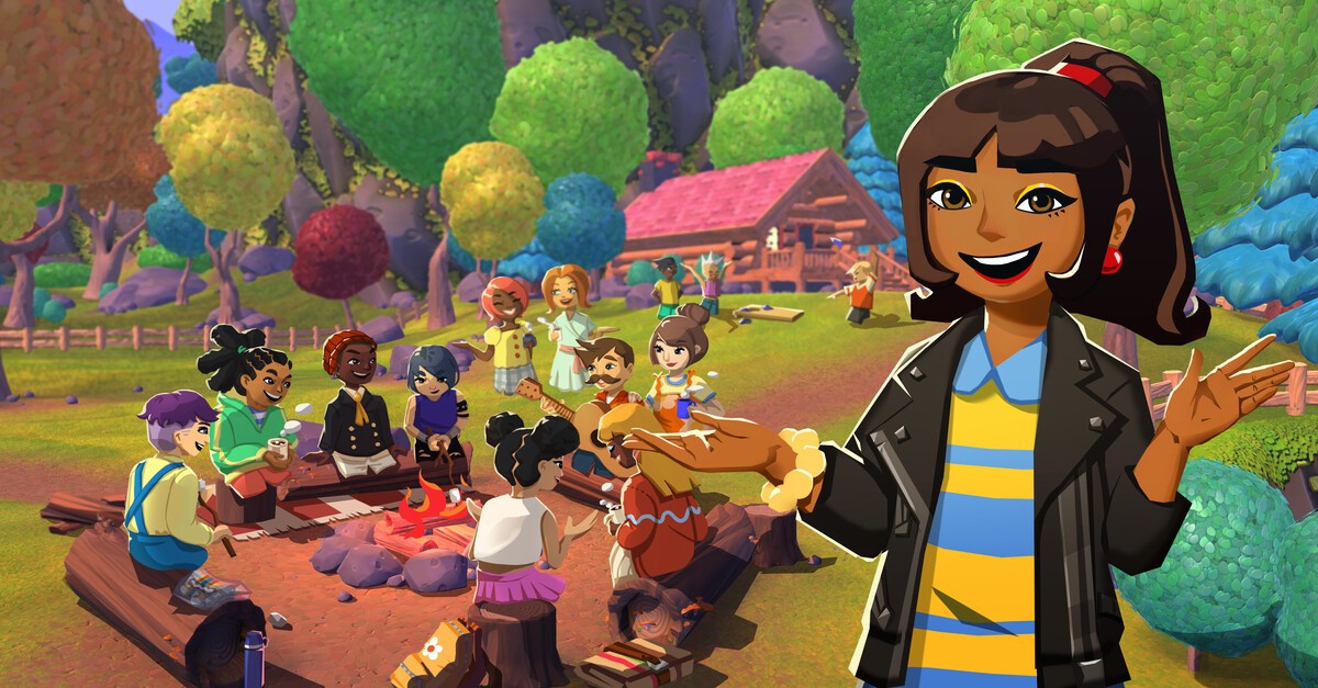
Altspace is a virtual reality (VR) social platform that allows users to connect and interact with others in shared virtual spaces. Altspace quickly gained popularity among VR enthusiasts and social gamers as one of the pioneering platforms in the emerging metaverse.
After Microsoft's acquisition of Altspace, our main objectives were to overhaul the website's visuals and ensure alignment with the Microsoft product family. Additionally, we identified a promising opportunity to introduce a new currency for the Mesh ecosystem and implement a streamlined flow for users to obtain tickets for live events by purchasing Mesh Coins with real-world dollars.
Role
UX / Visual Design
Team
Jeff Dull (Lead)
Type
Responsive Web / Mobile
Deliverables
Design System / Specs
Problem
Solution
User Research
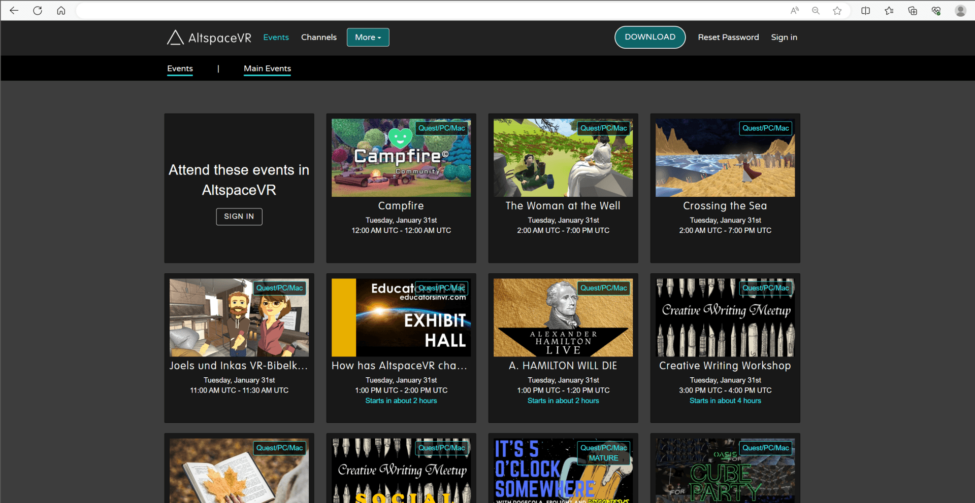
As the sole designer for this task, I had two main references for visuals: the current existing version of the website and the VR platform itself. Upon reviewing the existing material and branding, it became evident that a revamp was beneficial for both images and messaging. The events lacked clear hierarchy, and the type and spacing of information felt crowded and inconsistently spaced, resulting in a feeling of being overwhelmed.
The previous Altspace team had already conducted user research to validate site engagement, and shared the following with us:
• Users felt overwhelmed by the amount of events being displayed.
• Users had a preference for events that involved music.
• The lack of event categories made it difficult for users to find events that they were interested.
• Disorganization with layouts would deter them from continuing to engage with the website.
Secondary
Research
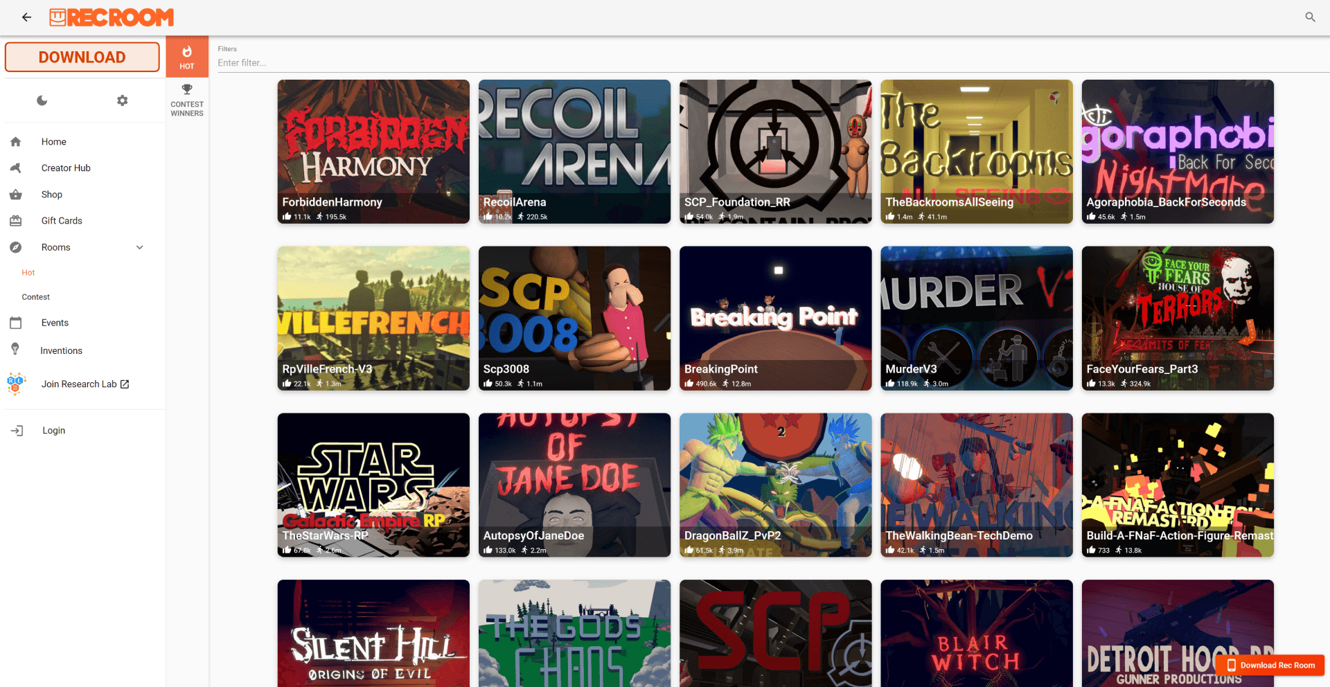
To inspire and inform our website redesign, I conducted a competitor analysis, focusing on Rec Room, our main competitor. One significant design pattern we discovered was the incorporation of a search bar, subcategories, and well-sized event cards. This pattern was beneficial in enhancing the user experience, making it easier for users to access and process abundant information.
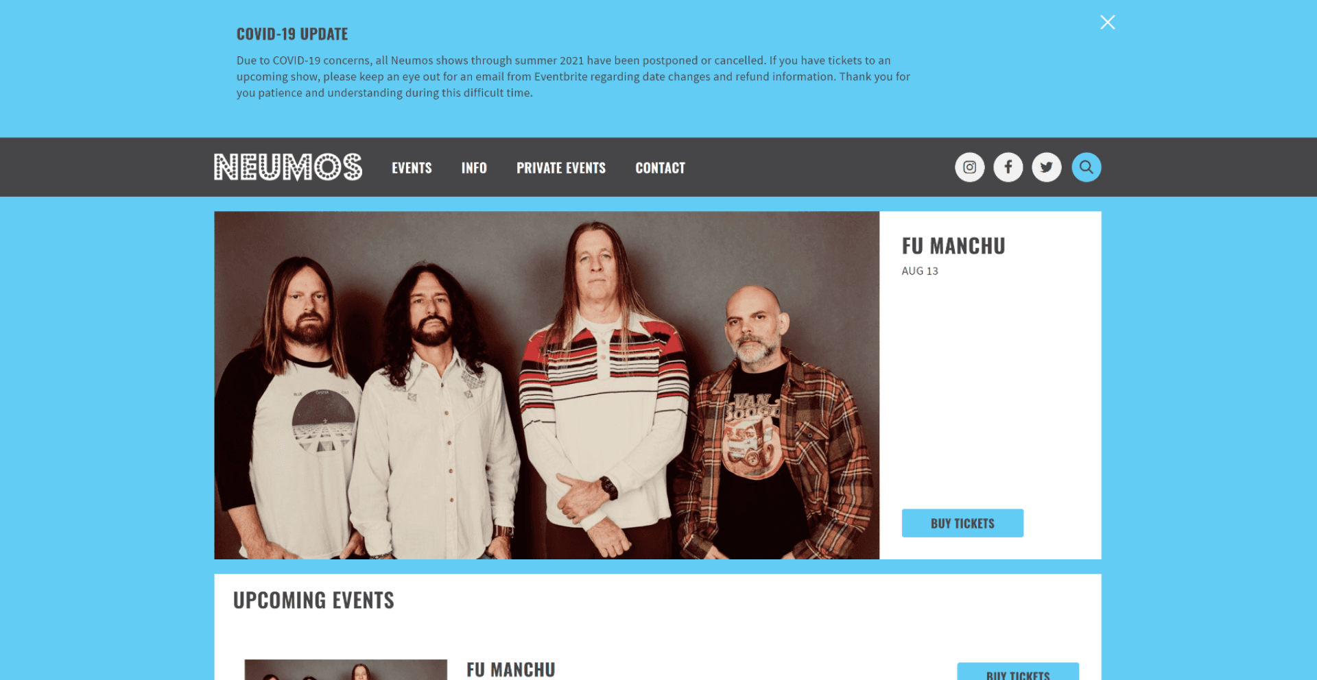
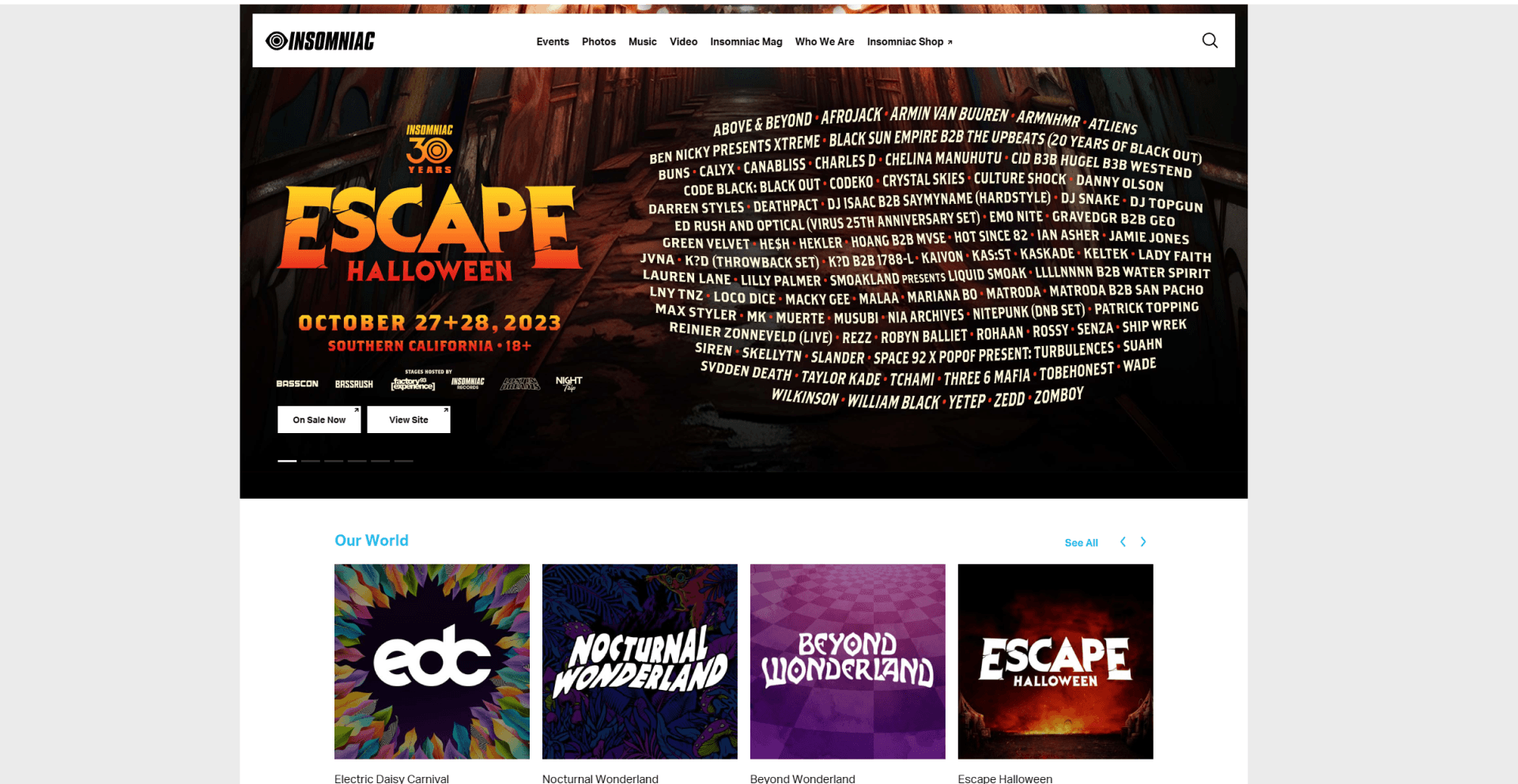
I also examined real-world event websites and noticed the effective use of large carousel images. Understanding this from a user perspective allowed me to identify which events held the most value.
Design System
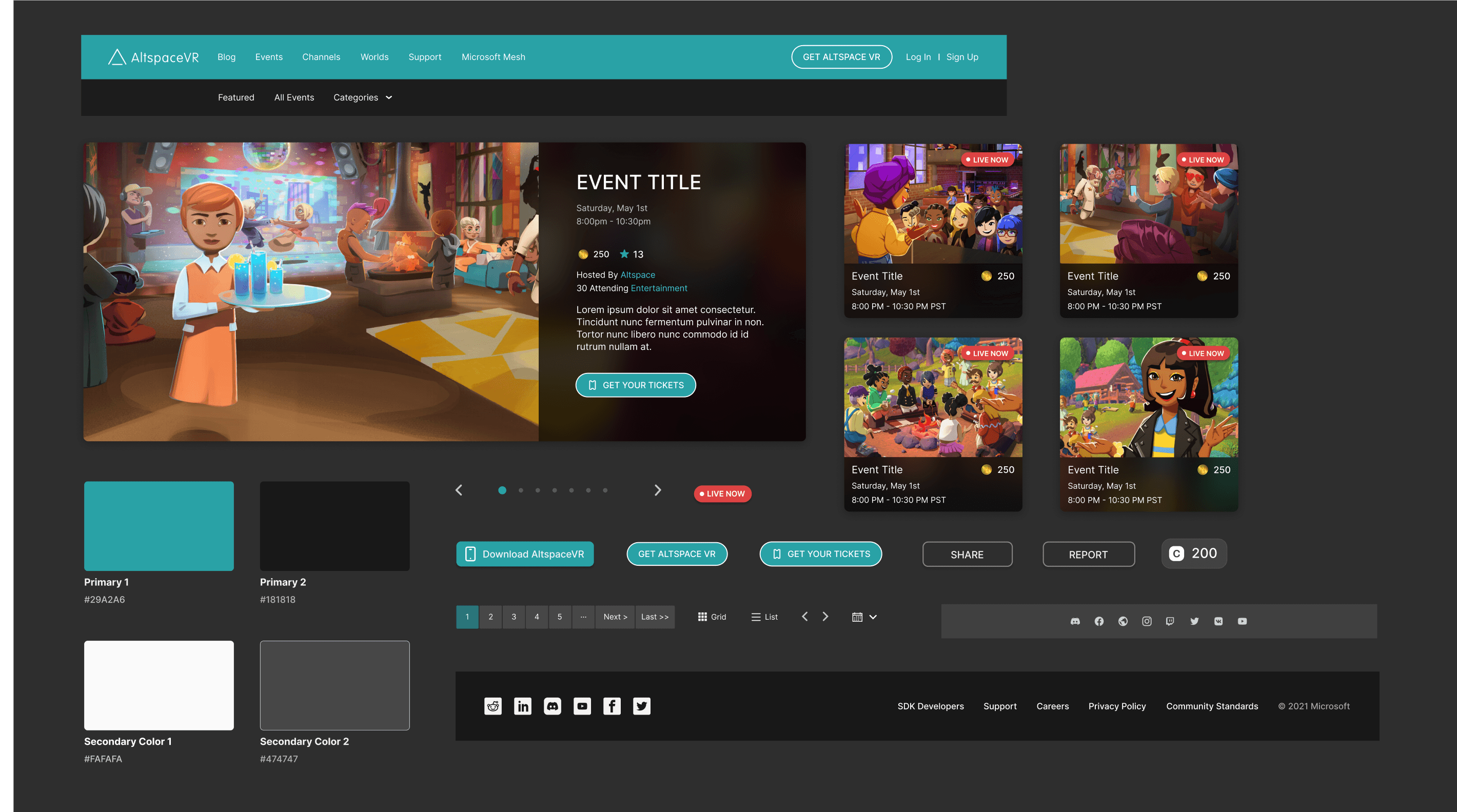
At this point, I was ready to start the ideation process. I first proceeded to draft up a simple design system to show how we could get the type and button stylings to feel more cohesive.
Events Redesign
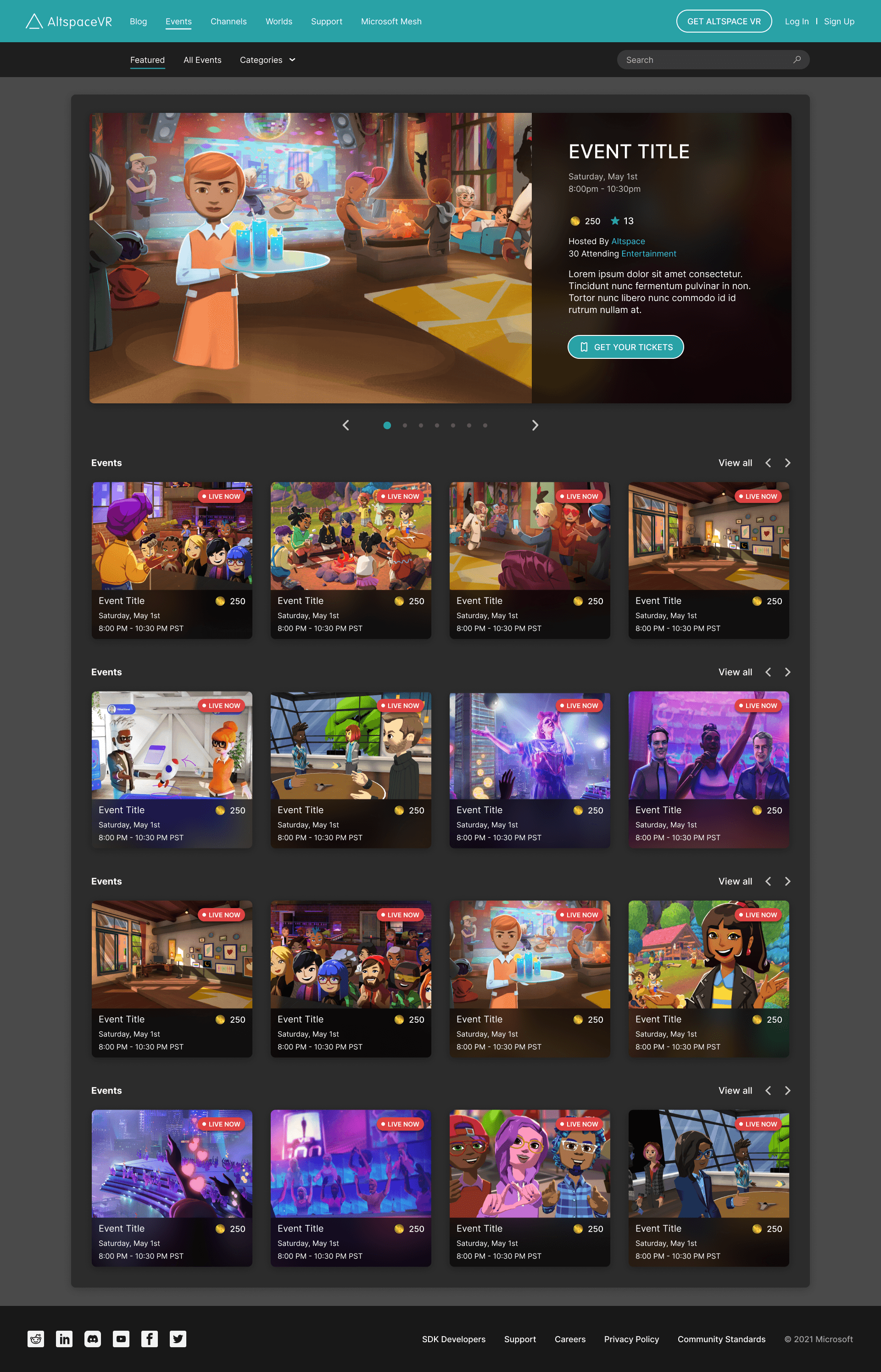
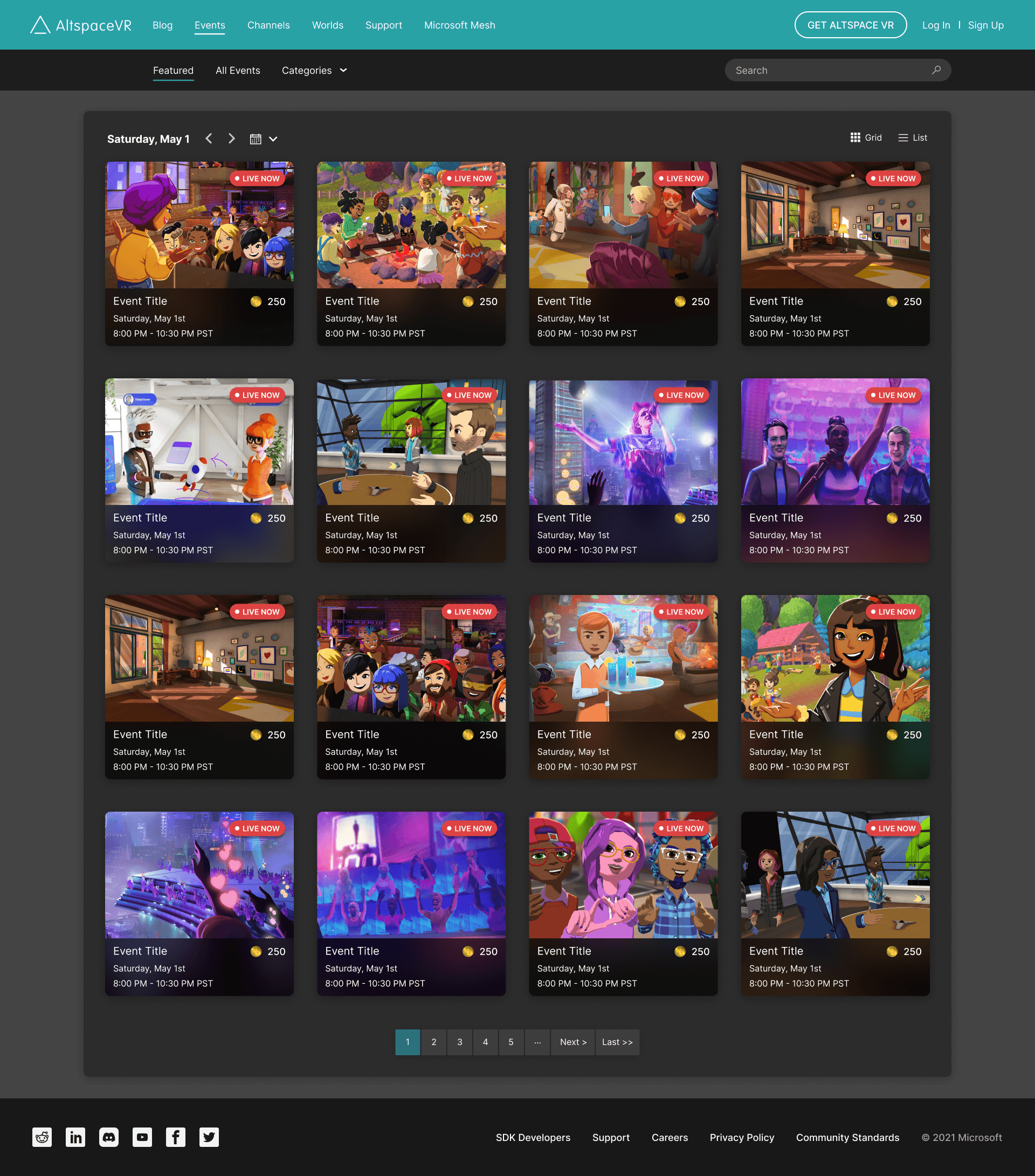
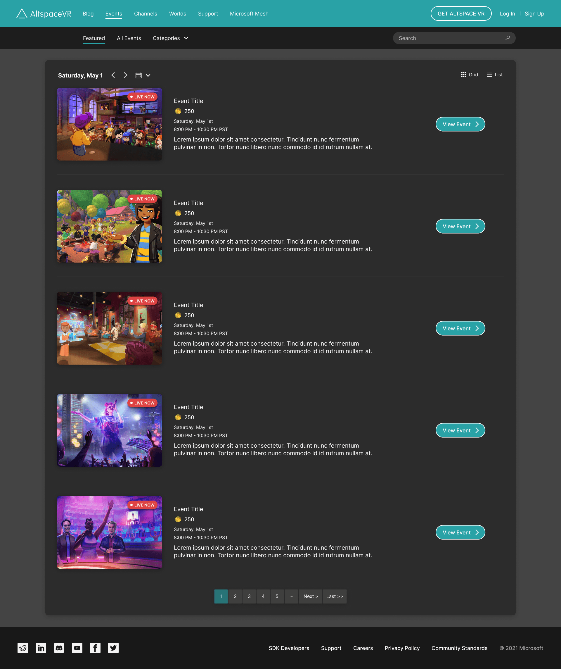
Next, I used these components from the design system to illustrate what a new version of the Home and Events page could look like.
Notable additions include a hero carousel image highlighting featured events, visible currency for cost entry, and the option for a list VS grid view.
Events Ticket
Flow
We presented the initial mock-ups to our stakeholders, and reception was positive.
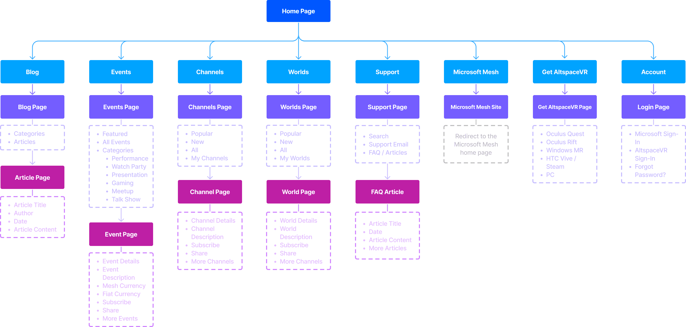
A site map was first created to help guide our user flows and give an overall idea of the improvements for the new site structure.
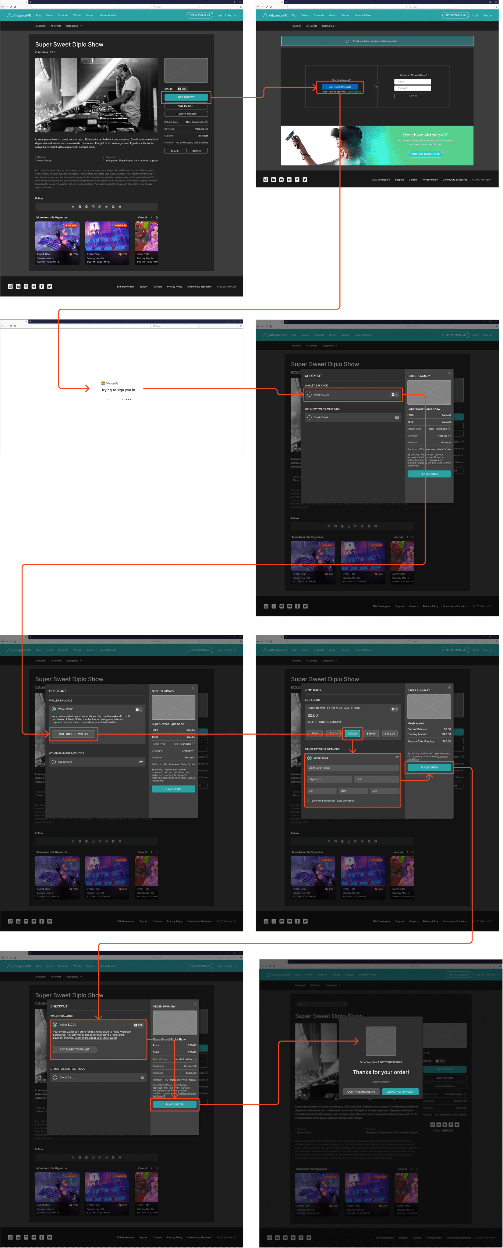
Next, I proceeded to map out the user flows for event-ticket purchasing using Mesh Coins. After referencing other microtransaction purchase checkout systems, I was able to come up with a flow that would feel most familiar to a gamer audience.

High Fidelity
User Flows
Benefitting from the Design System that was initially created, and being a highly visually oriented person, I began designing the various screens for the ticket purchase experience.
This flow illustrates the condition that a user is logged in, and if they had sufficient funds for purchasing the tickets.
Conclusion
Unfortunately, the journey for this feature came to an end due to changes in company initiatives, which led to a shift away from our Metaverse efforts. Despite stakeholders' approval of the redesign and purchasing flow, it is common in development for some projects to be cut.
In the event that we could have continued with this feature, our next steps would have been:
• Complete the full design system for both web and mobile, ensuring a cohesive and consistent user experience.
• Build out the remaining user flows to offer a comprehensive site experience.
• Collaborate with leadership and the development team to plan the development roadmap and implement the feature.
• Conduct research and usability testing to gather valuable user feedback and iterate on the experience further.
